
How to Create and Manage Content Blocks in Drupal
Blocks are one of the most powerful features in Drupal. They allow us to create and display reusable static and dynamic contents — such as text, images, banners, messages etc.
In this article, you will learn two simple methods to create content blocks in Drupal without using any contributed modules.
- 1 – Creating a content block
- 2 – Creating a block using Drupal Views
Method #1 – Creating a content block
This is the simplest and most commonly used method to create a static content block.
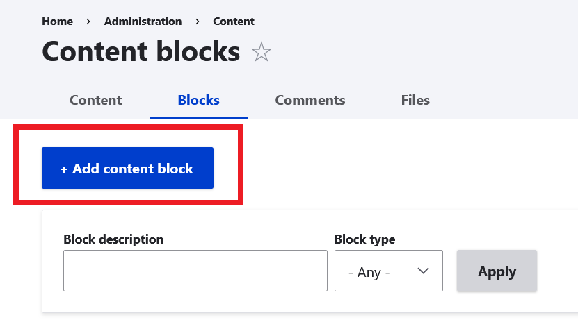
- Navigate to: Administration Content Content blocks
example.com/admin/content/block
- Click Add content block button.
- Enter block title and content of the block and create a new content block.
Method 2: Create a Content Block Using Drupal Views
Drupal Views allow you to create dynamic blocks that display content automatically based on filters and conditions.
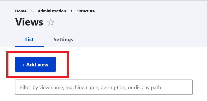
- Navigate to: Administration Structure Views
example.com/admin/structure/views
- Click Add view button.
- Fill options for the new view.
- Check the option Create a block and save.
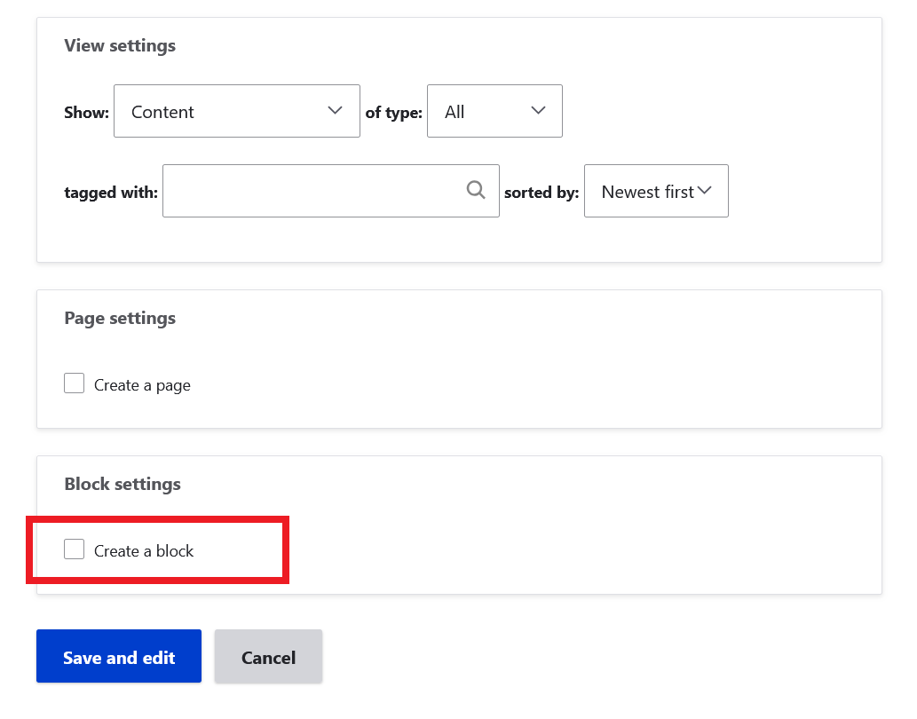
- A new block is created and now you can use this block.
Drupal makes it easy to create and manage content blocks without relying on additional modules. You can quickly build static blocks from the admin interface or create powerful dynamic blocks using Views.
By using these two core methods, you can design flexible layouts, reuse content efficiently, and keep your site well-organized and scalable.